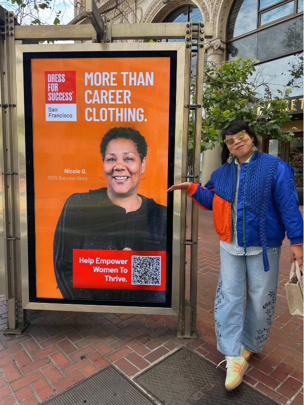
Dress For Success SF (DFSSF) Transit Ad
JUNE 2026
GRAPHIC DESIGN
CREATIVE/AD
The goal of the ad was to sharpen the public's perception of the organization.
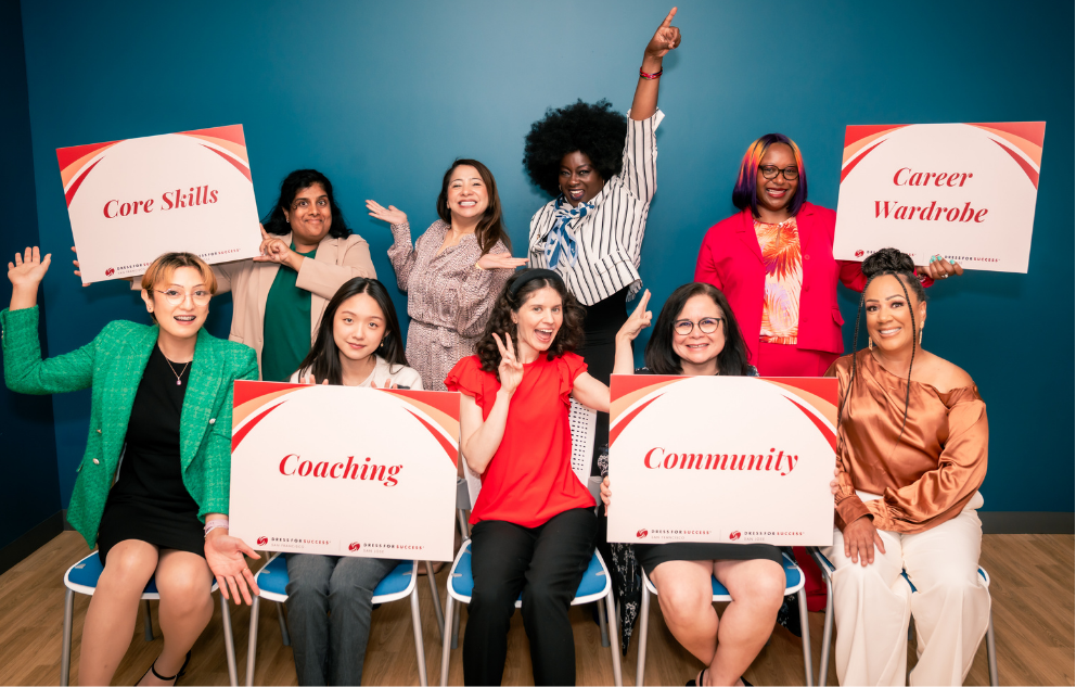
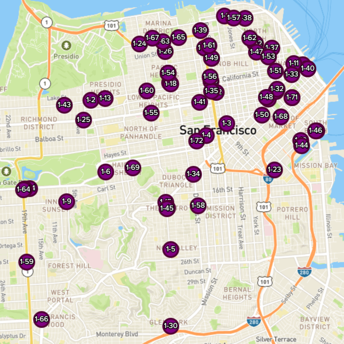
The campaign targeted Bay Area commuters/professionals who recognized the DFS name but not the full scope of its work today. It was also aimed at redirecting how people show up for DFS: through funding, volunteering, and community support, not just clothing donations. Clear Channel offered a pro bono digital transit campaign across 55 SF shelters (July 6–19, 2026) to promote this new message.
How it came together…
-
Purpose
Reintroduce DFS as more than workplace attire; clear enough to land in a 3-second commute.
-
Collaborate
Worked within DFS's brand and Clear Channel's templates, keeping decisions visible as the design evolved.
-
Adjust
After several iterations, we simplified the hierarchy, and sharpened the ad to focus on the messaging.
-
Deliver
A shelter ad built to work fast on a commute; true to DFS's 20-year legacy, clear and optimistic like the brief asked for.
Less noise. More signal.
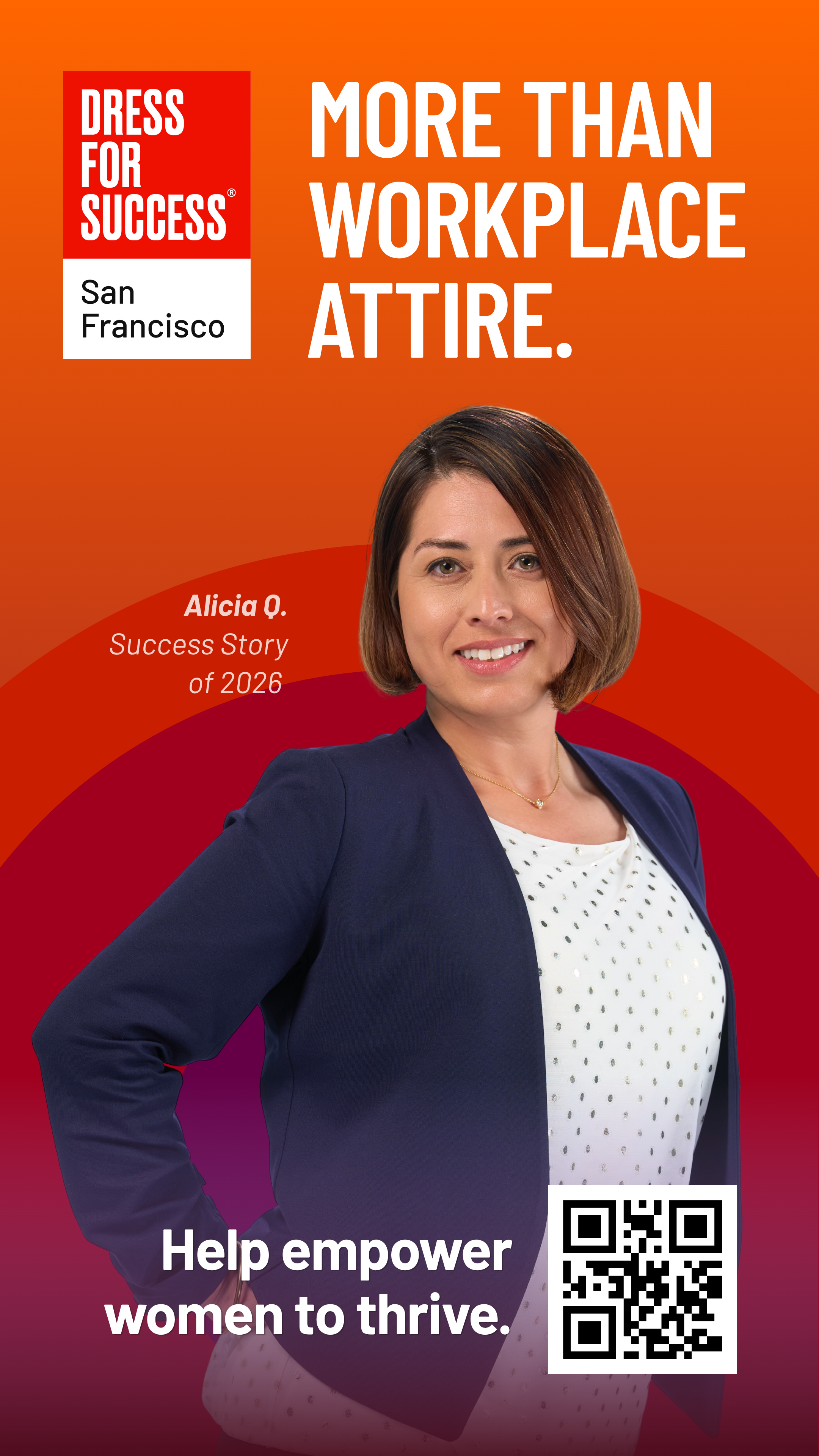
The early versions leaned on brand accents and a gradient background with the CTA and QR code floating loosely at the bottom. It looked polished, but these competed with the message and washed out the client image.
BEFORE
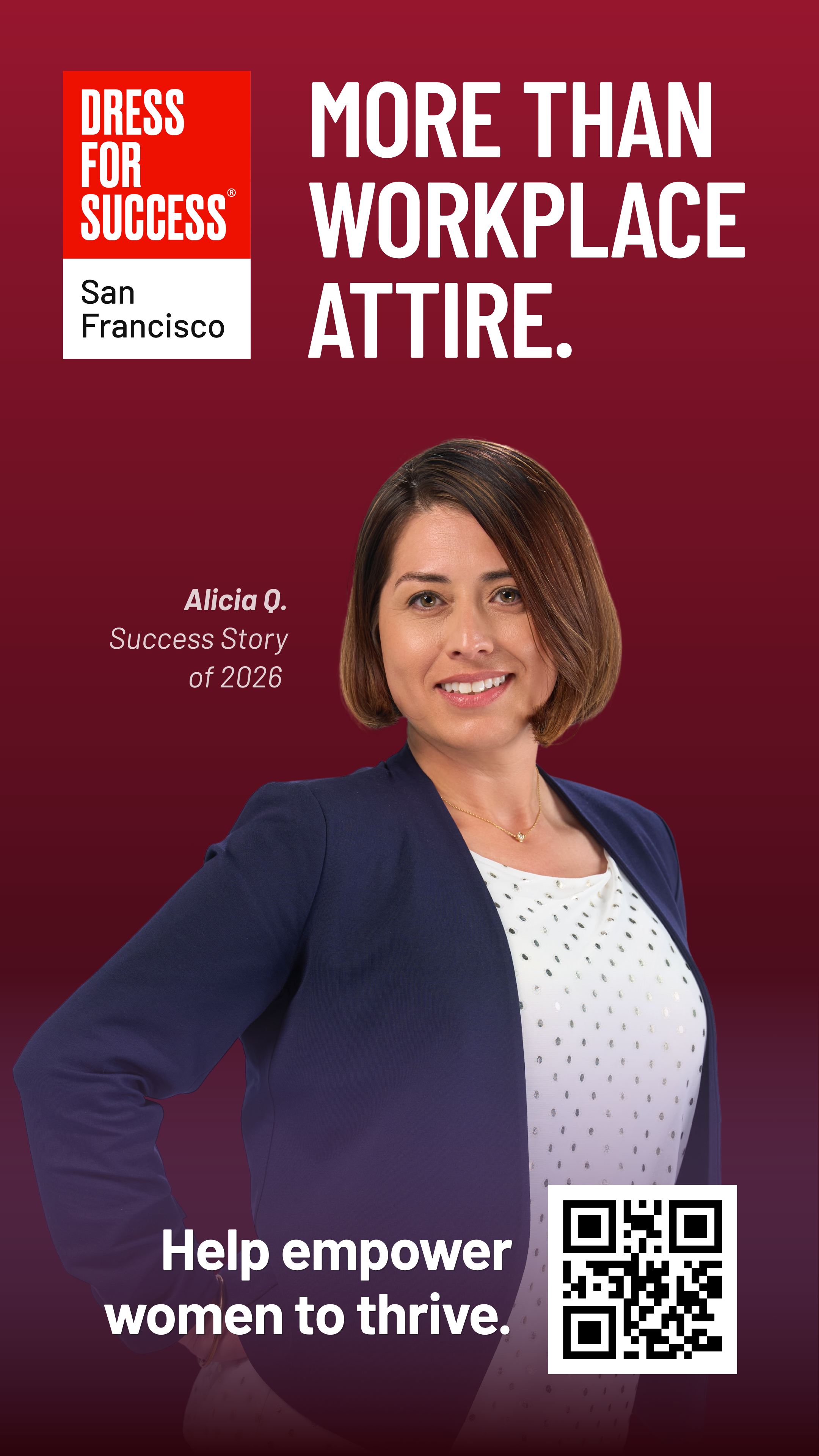
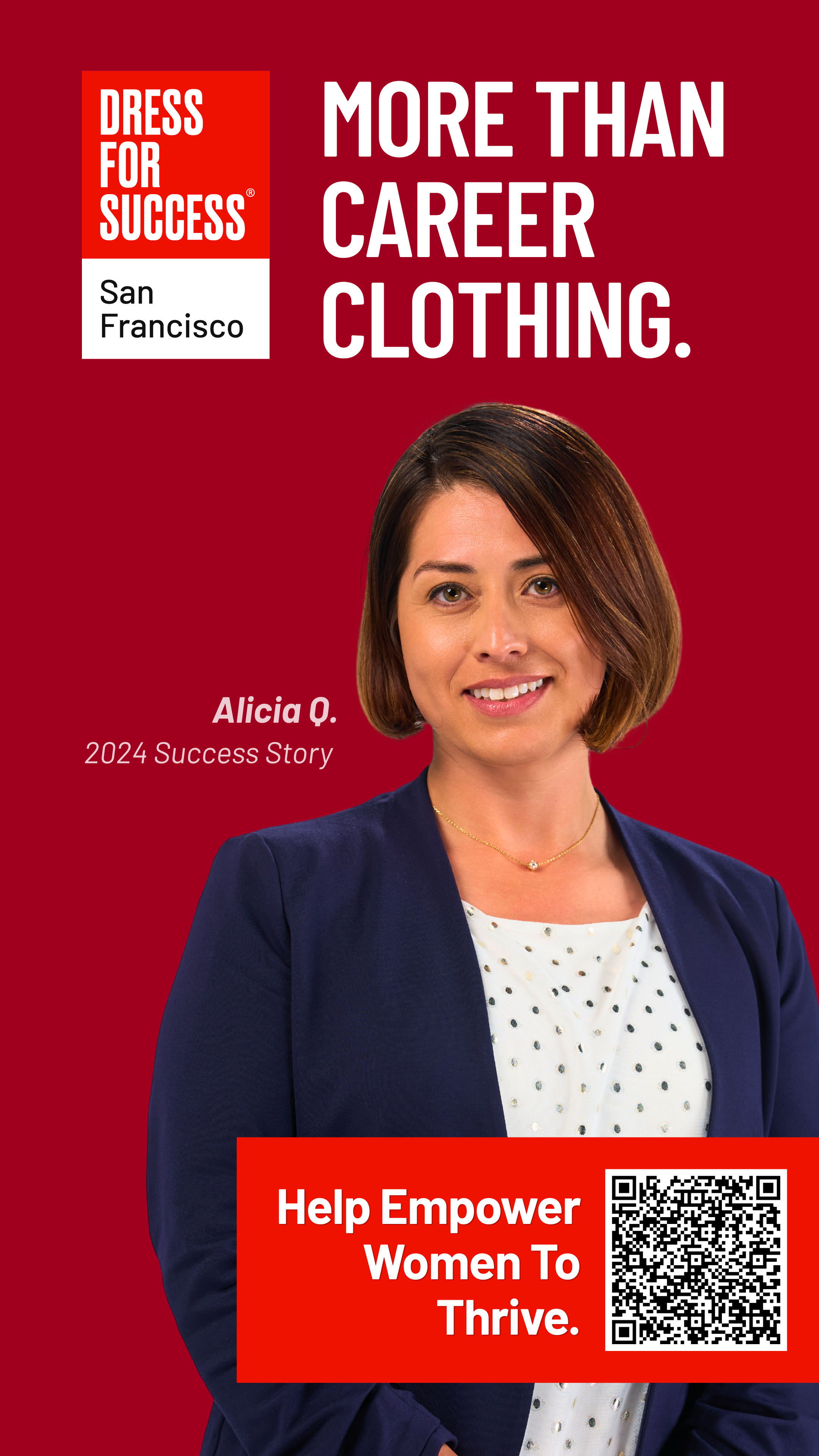
For the final, I kept it simple. The CTA and QR code were pulled into a clean red block. The client stands out. Together, we opted for "More Than Career Clothing" for a quicker, more approachable read.
AFTER
This transit ad let Dress For Success SF reach its target audience at a much larger scale.
3.9 Million
Projected impressions
1.8 Million
Weekly impressions
55
Transit Shelters
$0
Media spend
Go team, and big thanks to Lucy! It's a thing of beauty.
SALLY HAIMS, DRESS FOR SUCCESS COMMS COMMITTEE
Making a real impact in my own city!
As a designer, we are taught to have our own aesthetic show through. However, the biggest thing a designer can do is to listen to the needs of the client. In this case, less is more. A design does not need to be “beautiful” to make an impact, sometimes a simple image and a strong CTA can go a lot further in a short amount of time.